The headline worked. The portrait added a human presence. The primary button stood out. The opportunity was in how the supporting information was arranged.
Context: This is a founder-owned website reviewed using CXPR’s approach and Jaspurr’s Hero Hierarchy Reference. It is published here as a CXPR case study. Evidence status: The recommendations draw on published guidance and expert interpretation. No conversion lift, faster comprehension or measured eye path is claimed.
01 · Identify
The ingredients were strong. Their relationship could be clearer.
Business objective: help prospective clients understand Tara’s services and start a conversation. Visitor task: establish what she offers, see why she is credible, and choose whether to contact her or explore client results.
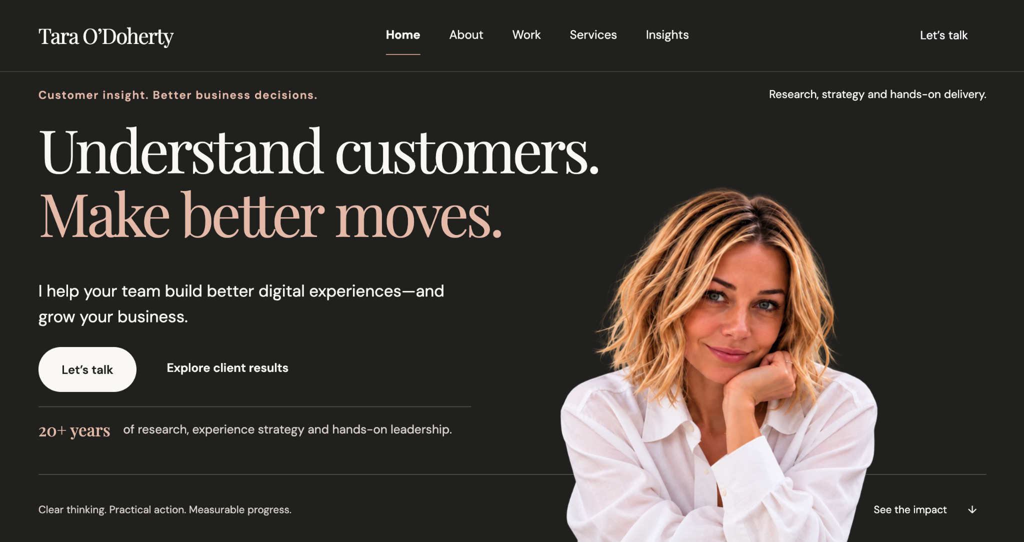
The screenshot showed a service description at the upper right, separate from the main copy. The left eyebrow repeated the headline’s broad promise. A further slogan sat below the experience statement. The supporting copy, action, and proof were spread over a large vertical area.
02 · Diagnose the opportunity
Help the supporting content earn its place.
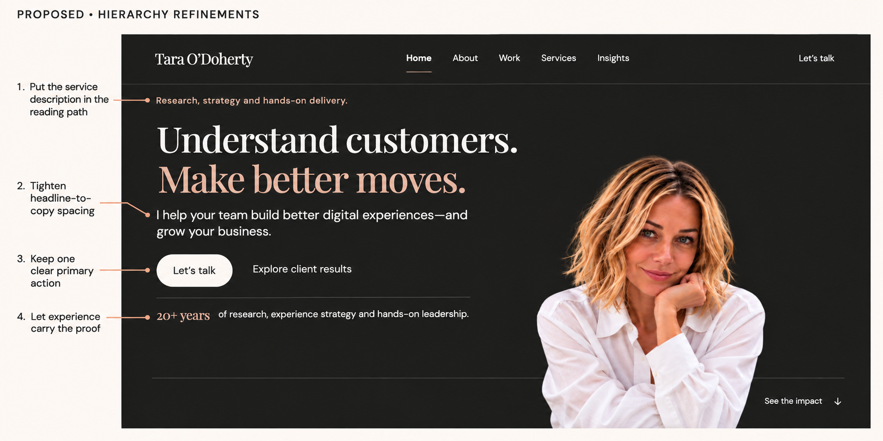
Our diagnosis: the service description could be easier to encounter beside the main message. Repeated promises could make room for specific credibility. Tighter grouping could make the explanation and next steps feel more connected.
The intended sequence is headline → explanation → primary action → experience, with the service descriptor providing context. This is a design intention, not a claim about how every visitor looks at a page.
| Observation | Opportunity | Recommendation |
|---|---|---|
| Service description detached at upper right | Bring the concrete offer into the main content group. | Use “Research, strategy, and hands-on delivery.” as the left eyebrow. |
| Large gap between headline and explanation | Strengthen their visual relationship. | Reduce headline size slightly and tighten the following space. |
| Bold secondary action beside the primary button | Preserve a clear action priority. | Keep the ivory “Let’s talk” button; use regular weight for “Explore client results”. |
| Another slogan below the experience statement | Give specific credibility less competition. | Remove the repeated slogan and retain the 20+ years statement. |
03 · Recommend & verify
Keep the character. Refine the hierarchy.
The implementation retains the charcoal and peach palette, existing typefaces, two-line headline and original portrait. The content is live HTML rather than text embedded in an image.
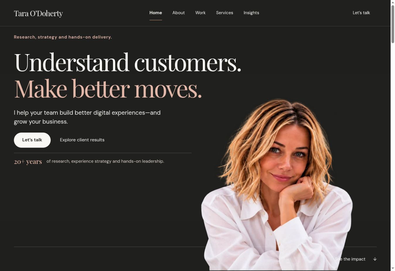
Responsive implementation: desktop retains the portrait on the right. Phones place the explanation, actions, and experience before the portrait in the visual flow. Tablet spacing is adjusted separately. Text can expand naturally instead of being clipped to a fixed-height canvas.
Verification boundary: targeted viewport and control checks assess implementation. They do not establish whole-site accessibility conformance or prove a business outcome. The portrait is descriptive, and the actions remain real links with keyboard focus.
The rationale behind the changes.
- NN/G: Visual Hierarchy in UX explains how scale, contrast, and grouping communicate importance. The precise spacing, type size and placement here are expert applications of that guidance.
- NN/G: The Layer-Cake Pattern of Scanning Content on the Web reports scanning research. It does not validate this particular hero or prescribe one universal reading path.
- W3C: Understanding Contrast (Minimum) provides the applicable text-contrast criteria. A screenshot alone cannot establish full conformance.
Research supports the principles. Context shapes the recommendation. Measured visitor and business outcomes remain unvalidated.